- client: McArthurGlen
- role: UX · UI Designer
- collaborators: Manuele Rosario Pennisi
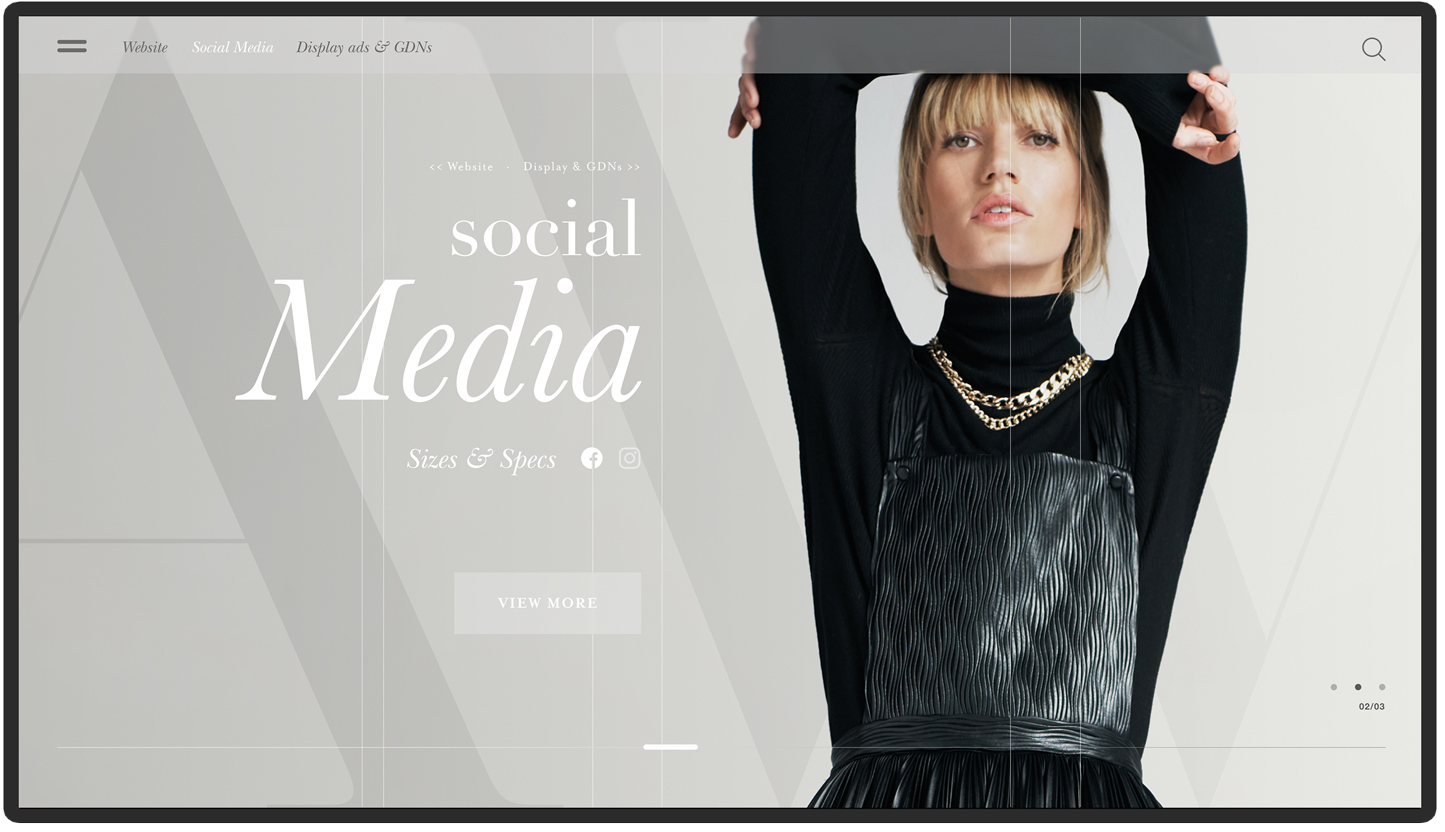
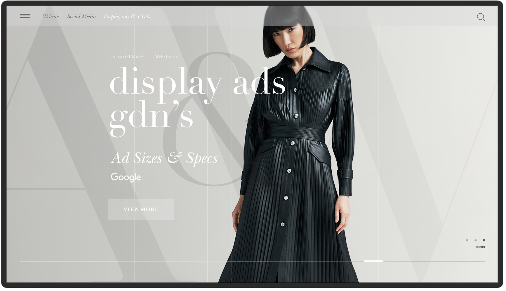
Redesign McArthurGlen’s marketing guidelines with focus on user needs and UX methods. The earlier version of the digital guidelines suffered from a lack of well-defined informative content, including design specifications and visuals. It was developed without considering the business requirements and user needs.
- project overview
- the challenge
- problem to solve
- solution
Upon joining the company, I noticed a significant communication and understanding gap between account managers and designers during the briefing process. The absence of a focus on UX and the failure to consider end-user needs resulted in an uninformative and inefficient process. Consequently, user tasks became time-consuming and needlessly prolonged. In order to address these issues, the product underwent a complete redesign and involved the addition of new functionalities.
- project overview
- the challenge
- problem to solve
- solution
- Redesign the guidelines according to the user needs (B2B).
- Align members of the business within different departments in the understanding of the briefing process to designers.
- Recreate the content of the guidelines that would include clear and informative specifications and visuals.
- project overview
- the challenge
- problem to solve
- solution
Apply an evidence-based methodology that involves end-users throughout the design process in order to design a solution that is easier to use, speeds up the briefing process, communication and understanding between all parties of the company. The skeleton and navigation were redesigned as well as the information architecture.


- The Process: Think, Make, Check
The think make check process, also known as tmc, is a systematic approach to problem-solving
and product development. it emphasizes rapid iteration and validation of ideas through three
key stages: think, make, and check.
In the think stage, teams brainstorm and analyze
potential solutions to a given problem, considering various perspectives and possibilities.
once ideas are generated, the make stage involves creating prototypes or minimum viable
products (mvps) to test these ideas in real-world contexts. this stage prioritizes speed and
agility, allowing teams to quickly bring ideas to life for evaluation. finally, in the check
stage, teams gather feedback from users or stakeholders to assess the effectiveness of the
prototypes. this feedback informs further iterations or refinements, ensuring that the final
solution meets user needs and aligns with project goals.
The think make check process encourages a continuous cycle of learning and improvement, driving innovation and efficient
problem-solving.
- The Process: Think, Make, Check
- Card Sorting: We used card sorting to organize insights from interviews. This was the starting point for creating an information architecture and develop new functionalities.
- User Flows: We created user flows for every task that users would perform on the website. This allowed account managers to see where the old version failed and why the company should dedicate time and costs towards the project.
- Heat Maps: Heat maps provided us visual data on where our users were focusing their attention when visiting our pages. Users were set up in various scenarios and were then asked to complete certain tasks.
- The Process: Think,Make, , Check
- Ideation & Sketching
- Wireframes
- MVP (minimum viable product)
- Iteration
- Prototypes
- The Process: Think, Make, Check
- UI Design
- Site analytics
- Usability testing
- Feedback system
- User meetings
- Digital guidelines
- client: McArthurGlen
- role: UX · UI Designer
- collaborators: Manuele Rosario Pennisi
Pinzutu Films is a media production agency, approached me to redesign their website. The primary requirement was to ensure that their video content was presented in the best possible way on all devices.
- project overview
- the challenge
- problem to solve
- solution
Overcome the technical challenges that video preview on mobile devices involves.
- project overview
- the challenge
- problem to solve
- solution
- Redesign the guidelines according to the user needs (B2B).
- Align members of the business within different departments in the understanding of the briefing process to designers.
- Recreate the content of the guidelines that would include clear and informative specifications and visuals.
- project overview
- the challenge
- problem to solve
- solution
Collaboration with both front-end and back-end developers to ensure a seamless implementation of solutions to optimize the video preview on mobile devices such as video transcoding and optimization, adaptive streaming support, bandwidth management and using the content delivery network
- The Process: Double Diamond
the double diamond ui process is a design framework that emphasizes divergent and convergent thinking to address user interface challenges effectively. it consists of four phases: discover, define, develop, and deliver. in the discover phase, designers immerse themselves in understanding user needs and challenges through research and exploration. this is followed by the define phase, where insights are synthesized to define clear problem statements and objectives. the develop phase involves ideation and prototyping, exploring various solutions and refining them based on user feedback. finally, in the deliver phase, the chosen solution is implemented and refined for release. this iterative process enables designers to explore a wide range of possibilities before converging on the best solution, ultimately leading to well-crafted user interfaces that meet user needs effectively.
- Discover: Research
- Research
- Contextual inquiry
- Users interviews
- Online Surveys
- User personas
- Competitive analysis
- Define: Analysis
- Card sorting
- Feature prioritization
- Story mapping
- User stories
- Journey map
- Develop: Ideation & prototype
- Site map
- Information architecture
- Paper prototyping
- User flow
- Wireframes
- Prototype low-fi
- Usability testing
- Deliver: Testing & UI
- UI design
- Visual mock-up
- Research report
- client: McArthurGlen
- role: UX · UI Designer
- collaborators: Manuele Rosario Pennisi
Collaboration with Christie’s Art Director and Developers to create a design system for the inaugural website for the 1-54 Contemporary African Art Fair. Our goal was to organize and showcase the diverse works of all the exhibitors and artists in a visually compelling way
- project overview
- the challenge
- problem to solve
- solution
During the lock down, we faced the challenge of providing buyers with a captivating experience to view artworks going up for auction on our website since in-person viewings were not possible. This prompted us at Christie’s to develop an innovative solution that would showcase the artworks in the best possible way. For the first time, we introduced features such as scale, zoom, and live chat with exhibitors to enhance the presentation of the works. One of the significant challenges we encountered was categorizing and organizing over 1000 artworks effectively. We carefully formatted the extensive amount of data into JSON files, ensuring that the specifications and details of each artwork were accurately represented. This meticulous process was essential to provide buyers with comprehensive and reliable information about the artworks.
- project overview
- the challenge
- problem to solve
- solution
Providing buyers with an engaging and interactive experience to view artworks going up for auction online since in-person viewings were not possible.
- project overview
- the challenge
- problem to solve
- solution
By implementing these features and overcoming the data formatting challenge, we aimed to offer a seamless and immersive digital experience for buyers to explore and engage with the artworks. This initiative represented an exciting milestone for Christie’s, as we adapted to the circumstances and pushed the boundaries of online art viewing, enabling buyers to make informed decisions and appreciate the artworks despite the limitations imposed by the lock down
- The Process: Design Thinking
the design thinking process is a human-centered approach to innovation that
places empathy for users at its core. it typically consists of five stages:
empathize, define, ideate, prototype, and test.
in the empathize stage,designers seek to understand the needs, motivations, and
pain points of the
users by immersing themselves in their experiences. the define stage involves
synthesizing gathered insights to define the core problems and opportunities for
design. ideation follows, where designers generate a wide range of creative
solutions without judgment. these ideas are then prototyped in the next stage,
allowing designers to quickly iterate and visualize potential solutions.
finally, in the test stage, prototypes are tested with users to gather feedback
and iterate further, ensuring that the final solution effectively addresses user
needs. this iterative and user-centric process encourages innovative
problem-solving and leads to solutions that resonate deeply with users.